First intial idea of Digi-Pak

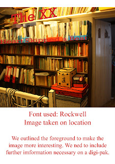
I think cartooning is a very strong way of editing an image. It was influenced by Mika's 'We Are Golden' Album and poster look which has a cartoon feel to it. The font used for the titles may have to be a bolder colour such as a red to match the one in the flag within the image, red is a good colour to use as it grabs the viewers attention. I would need to find a strong image which works well with this one, possibly a close up of a few items with a subliminal message of 'xx' in it. I decided only to outline the foreground of the photo, i thought that creating the same effect over the whole image would be over powering. The colour in the image match our music video, however i did slightly change the saturation to make it a bit more dull.

I cartooned the foreground of this, unfortunately there isn't much in the foreground of this image compared to the one of the attic. I decided to use a bold red font, having found from the previous rough that the grey wasn't very effective. I used the lines of the shelves to incorporate the writing into the image.
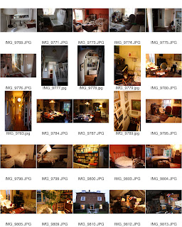
Contact sheet of images taken during our filming

The photos are very strong and work well, the lighting created very warm effects and cast shadows across the images following our strong mise en scene.
 I think cartooning is a very strong way of editing an image. It was influenced by Mika's 'We Are Golden' Album and poster look which has a cartoon feel to it. The font used for the titles may have to be a bolder colour such as a red to match the one in the flag within the image, red is a good colour to use as it grabs the viewers attention. I would need to find a strong image which works well with this one, possibly a close up of a few items with a subliminal message of 'xx' in it. I decided only to outline the foreground of the photo, i thought that creating the same effect over the whole image would be over powering. The colour in the image match our music video, however i did slightly change the saturation to make it a bit more dull.
 I cartooned the foreground of this, unfortunately there isn't much in the foreground of this image compared to the one of the attic. I decided to use a bold red font, having found from the previous rough that the grey wasn't very effective. I used the lines of the shelves to incorporate the writing into the image.
 The photos are very strong and work well, the lighting created very warm effects and cast shadows across the images following our strong mise en scene.
No response to “Digi-pak immediate ideas”
Leave a reply