Sunday, 13 December 2009
Charlies evaluation
A2 Media
1. In what ways does your media product use, develop or challenge forms and conventions of real media products?
1. Our media product has been influenced strongly by many elements of the music industry. We researched music videos made for upcoming or famous artists and realised that the majority of videos were performance based; we decided to base ours on a narrative, which challenged the conventions of media products and also Goodwin’s theory. A narrative based video is more suitable for The XX’s song as it strongly fits the indie-pop genre. As ‘Heart Skipped a Beat’ is a romantic love song, we decided that our characters should appear as innocent and pure. We did this by making their costume youthful and formal, and ensuring the girl wore no make up. This challenges voyeurism and how generic videos use woman as ‘sex objects’. Another feature that challenges modern day music videos is our mise en scene as our location’s are of an old house and some of the lip sync is filmed in a University rather than a metropolis or a studio. We chose to use these locations as vintage appeals to celebrities and teenagers at the moment, this works as our target audience is of the adolescence. For our advert and digi-pak we did not feature the artist’s faces which challenged the media industry of today, we found it was unnecessary for our product as The XX are relatively unknown. The logos and companies we chose to use on our digi-pak and advert are Myspace and Warner Brothers. We decided both of these companies were relevant as Myspace is where The XX built themselves a name for themselves, and Warner Brothers are known world wide. Myspace is not usually used on products as a logo and company so this challenges the conventions.
We featured the artist by using lip syncing which uses conventions of music videos, within this we used eye contact which supports Goodwin’s theory ‘notion of looking’. Including a relationship between lyrics and visuals worked well, a feature which is commonly used as it makes the video and song a complete piece rather than two separate medias put together. Through research my group discovered that visuals always move to the beat of the song, and change shots relatively quickly to keep the audience interested. We supported this idea and cut our video strictly so that it did not seem to be behind or ahead of time and ran neatly. Our digi-pak includes lyrics, websites, screen grabs, song lists, titles and tour dates which are typical features of a media product. We also used images and colours which supported our mise on scene and carried on the overall look for all three products. On both the poster and the digi-pak the website is stated so that the viewers can find out more information about the artist which is commonly used. Also we had star ratings and comments from magazines or newspapers to promote the artist.
Developing our music video to make it unique was something that appealed to us. We began by using subliminal messages during our video of the artists name ‘XX’ which is featured in various parts of the song; on the mirror, the bottle in the cellar, the books and on the tissue at the end. To carry on this idea of using words, we wrote the lyrics as they came in the song ‘I’m not finished’ on the sheet music which the boy turns to, this is a direct link between lyrics and visuals. Screen grabs, a unique love letter and signatures are features we included in the digi-pak which are a development of typical products, most of which have unique selling points that use further technology such as website codes and blog information.
2. How effective is the combination of your main product and ancillary texts?
2. When designing our digi-pak and magazine advert, we ensured that there was a strong link between each of the products and that they both referred directly to our music video. Many digi-paks and adverts today use the artist’s faces to sell the products, but as The XX are relatively unknown we chose to use establishing shots of the house we filmed in, creating a link between the products. Our digi-pak has a vintage, feel to it, carrying on the characteristics of the house; this is also mirrored in our advert. The poster particularly carries on the ‘hide and seek’ approach we took to the song, as it is of a dolls house. It is interesting how when you watch the video it is hard to link which room leads to which corridor, so the poster works as a ‘map’. We included some unique selling points in our digi-pak such as signatures, bonus tracks and a letter which we originally pitched at the beginning of our project. We carried the same font over from the digi-pak to the poster so that it was recognisable and unique to the artist.
We decided that a visual theme throughout all three products is necessary to give them an individual brand identity. Our artists’ identity is shown through images of rooms within a house which are quaint and mysterious, reflecting the bands current status as they’re not yet recognizable in the market. We believe that this idea of using a vintage style in a subtle, non-overpowering way appeals to teenagers who are our target audience, particularly those who enjoy different variations of indie style music. The products appear innocent and honest, the rooms within them messy and old fashioned, telling a story within themselves which we think The XX tell in their music. We hope that by creating powerful, individual products, which look good and pleasing to the eye, the products will sell themselves by word of mouth, rather than acknowledgement.
3. How did you use new media technologies in the construction and research, planning and evaluation stages?
3. Research began by looking into music videos which were available to view through the internet on youtube. We looked into Goodwin’s theory and analysed many videos which we felt would influence and help develop our initial ideas from our pitch. We particularly liked Imogen Heaps music video for ‘Goodnight and Go’ as it features a dolls house, and has a quirkiness to it which is appealing. It was useful to use the internet to research into music videos within the genre from well known bands, as we had to see what it was that sells to our target audience.
As a group we did research into various music directors and posted our research onto our blogs. We researched and analysed Spike Jonze, and Chris Cunningham, who are unconventional directors.
As our band had a myspace, we were able to get information from there and get a feel for their style and music. This meant we could have a deeper thought into whether or not the way we were interpreting the song suited the band or not. The XX have a band website which we were able to look at, and we discovered that their song ‘Heart Skipped a Beat’ already had a video to it which was a large X windowing different scenes and filtering them into various colours. We found the video boring, and indifferent to many amateur videos, it also did not strongly support any of Goodwin’s theories.
We used Final Cut to produce our media video, where we also edited it in various ways. Having looked at past media students work, we used the ghosting effect by layering footage and changing its opacity, this was effective and fit our theme. Our college blogs had a large influence on our work as we received feedback through them from other students and also the public as our video was posted on there, and also on youtube. The blogs meant that we could look at other peoples work, and get ideas from their rough cuts, particularly when it came to editing and construction. In conclusion we decided to use filters to make our video have a greater ‘antique’ feel to it.
4. What have you learnt from your audience feedback?
4. We have received feedback at various points during our project. Our pitch was successful and full of many strong ideas which we carried out to the end of our project. We pitched that we wanted to hold a strong hide and seek feel to out video, along with a mise en scene which would stand out from the conventional ones. When explaining our ideas, we did it by breaking the song up into its verses and describing the visuals with the lyrics or music. I had also looked into ideas for the digi-pak which we ended up using a lot of for our final such as the letter idea. This was helpful as it meant we were organised and had a clear idea in our head. We had very good feedback from it, but found that for our music video we had to include more performance and lip syncing when initially we planned on having only narrative.
Our rough cut received positive feedback on the blog from students and our teacher despite the fact we knew that there was a lot that could be improved or changed. There were suggestions that we should include more lip syncing in a separate location and also edit the footage more interestingly. Our peer group which are also our target audience particularly liked our unique location we used, which suited the innocent approach we had to the song. We also had a variety of shots, but it was felt that more close ups of the artist would make their recognition stronger. As a group we took the advice and ended up with a second lot of footage filmed at a separate location which was useful for the chorus’s towards the end of the song as it featured lip syncing.
Our blog was kept up to date throughout; we ensured that there was work on there illustrating each stage so that we kept on top of what we were doing. Our teacher told us that our blog was good but that further research into supporting Goodwin’s theory would be helpful, and also research into our digi-pak such as labels. I cartooned some images that we took on location which we thought we may be able to use for our digi-paks and/or magazine advert, the influence for this came from Mika’s cartooning affect he uses as an artist signature.
Our final music video was given positive feedback overall. Personally if I could do it again I would have made the lip syncing towards the end more tidy and filter it brighter. I am particularly happy how our artists’ innocent is portrayed in the house and that both character and location have similarities. Our digi-pak received particular praise as we decided to make a CD gatefold, rather than a DVD cover so that we could show our strong selling points within the case. For the digi-pak we used the cartooning image as the front cover as it gave a youthful look to a ‘vintage’ image. The digi-pak was reviewed and people were impressed by how we used various images and the layout.
Friday, 11 December 2009
Evaluation
Alice Newnum
In what ways does your media product use, develop or challenge forms and conventions of real media products?
Our media product has many conventions of real media products in the way we have created and developed it. We kept our music video fairly conventional, as the audience is familiar with those media forms.
We researched the more unconventional directors like Spike Jonze and Chris Cunningham. We really liked the idea of having a music video that was different to the rest, however these directors do not usually make videos for our type of genre, they usually do music videos to more electro music. So we tried to give it more of a feel of those directors but keeping to the genre of the song.
The media product we made is a narrative based music video, it also features some performance of the artists lip-syncing. This is a challenge to most music videos as they are usually performance based and we didn’t use it as the main aspect of the video. We wanted to create a more original music video something that would fit the genre of music. It still conveys the main media conventions of a music video even though it is narrative based, we has used close ups of the artists featured in the video. Also thought out the video we have placed the band name “XX’’ slightly in different places for example on the mirror with xx written in condensation almost like a subliminal message to make the band identity and keep the audience familiar with the name. Which is a convention used in many music videos lots of close ups we did this as well by having the band name to meet demands of the record label. We used many camera shots to establish the scene as location is a big part of our music videos style then we would then focus in on the artist with close ups and mid shots. We also used the convention of lyrics and visuals, we feature ‘im not finished with’’ as it is sung. We also incorporate music and visuals by having the artists walk to the beat, as well as editing so the cuts go to the beat of the music. We also have Intertextuality in our music video, the bathroom scene where the boy sees the girl in the mirror relates to Romeo and Juliet the version directed by Baz Lurhmann, in the movie there is a scene where the boy and girl both see each other in the bathroom looking through the fish tank.
Another challenge of our music video is our mise en scene we choose to do a vintage old school look rather than the all glamed up look like most music videos you see on mtv. This style relates to the genre of music and the audience that follow this type of music indie acoustic. We did this by filming in an old house with lots of antique features and keeping the lighting looking fairly natural. We feel the old look fitted well with the music and would work well as a style for the band, which we then incorporated into the digi pak and advert. The actors also followed the natural theme by their costumes, we kept them smart casual and in the old style, this developed on the fashion that’s quite popular at the moment vintage it went against the usually sexually provocative look most artists display in their music videos.
We took a different approach to the usual performance sequence in music videos and we kept it in a block, the reason we did this because we didn’t want to disrupt the narrative and they worked well being more separate. We conformed to the usual conventions by having lots of different shots and keeping the audience interested. We incorporated a lot of match on action shots these worked really well with the beat of the music creating a smooth transaction. We use the media forms and Goodwin’s theory however we put these classic features in a more suttle way as this sort of genre of music doesn’t usually go with extreme these.
Our music features a hide and seek narrative. Sort of an ideology of seeking for love and hiding form the past they can’t accept.
Our digi pak and advert challenge the usual media products as usually the artists are featured on the font cover as a close up. On our product we used images from the location we did this as the house in our video is a big part of the style and we wanted to keep everything linking to this bands style. So the audience will become familiar with that bands style. Our advert and digi pak however did fit with the standard forms by having the website and company logo’s. We decided to use my space as a logo as this is now a feature for most bands as myspace is a place to now look for new artists. Our digi pak was in a gatefold design as we were asked to make a special edition one and we thought the gatefold would give us room to add all these extra little features. We went with a quite quirky design after looking at artists like Mika and Bjork. We added quite personal touches like the artists signatures making it more unique.
How effective is the combination of your main product and ancillary texts?
Our music video, digi pak and advert work well altogether as a combination. The reason they work well is because they all follow a distinct theme and style. We connected the digi pak and advert by using the same font and colours. We made sure we had ‘The XX’’ in big and in the same font for both digi pak and advert. To link the music video to the digi pak we placed stills on the back. For the advert we came up with a dolls house idea, which really helps to display the style. We put the images we took on location and created them into a dolls house on Photoshop. This gives the potential buyer a clear link between the music video and the advert. We did not use any stills form the music video on the advert as they were quite pixel Ted and did not look as good and professional.
All three come across as quite effective and would definitely appeal to the target audience of the genre, our target audience is teenagers and young adults interested in acoustic indie. We keep a visual theme, which is the location and house this brings all products together. All the products appeal to this audience, as it’s quite a big scene at the moment finding the more different and original music and bands. We really use this idea and try to keep the music video different. We create a certain representation of our artists in all three products, we keep the artists in a casual way we don’t over dress them and we keep the style of genre by having them look natural and making our products have an old antique feel. We have steered away from the artificial look of most artists.
What have you learnt from your audience feedback?
All the audience feedback has contributed a lot to how the music video should be edited, what should feature and even lead our group to do another filming session. Using the bog as a class means all our classmates have access to our work and can comment freely their thoughts. We presented our pitch for the song we wanted and this was in front of all our class, this gave us really in depth feedback, specifically to our idea fitting our genre. This was really useful after the rough-cut each group gave us feedback we had negative and positive and it was good to see what was working well and what we could improve on. It put in perspective what our music video was lacking. It ended up, as we needed to feature the artists more closely and get them lip-syncing a bit more maybe in a new location. Our teacher also commented on the bog, which helped us keep on the right track. After our first pitch it was fairly useful hearing people thoughts to develop on the idea.
Feedback involved going thought Goodwin’s theory and analysing our rough-cut, it made our group realise how important it is to get an audiences point of view on your work. What we really got out of having so much feedback was what is working and effective. A lot of groups commented on our style and theme incorporated by the pros and they said they thought it was effective and fitted with the tone of the music. This is one of the comments we received ‘Lots of different shots, quick changes, good story telling, good costumes and interesting footage’’ It was good to get feedback from our target audience teenagers that are interested in music.
We also got access to other groups progress, looking at the other groups would always give us ideas on how to improve our music video and remind us to think about certain points.
How did you use new media technology in the construction and research, planning and evaluative stages?
Through out our whole project we have used technology. At the beginning of our task we were given a cd of tracks to choose form and that’s all. So immediately we went on the Internet and got up the lyrics of the song’s we liked. If we didn’t have access to the Internet, our music video would not be as accomplished. We used the Internet to research everything; band, other music videos in that genre, different adverts, cd covers. It gave us most of the ideas. We also used social networking sites for instance myspace, as myspace is a big part of the music industry and it is becoming more popular to access music online and even buy it online. On myspace we found the XX and we got a feel for the sort of genre of music by listening to a few other tracks. We concluded that the genre was acoustic indie after listening to more.
On you tube we found the XX’s music video for ‘Heart skipped a beat” this was interesting as we were not expecting the video we found, as it seemed quite weak and dull and it didn’t seem typical of the genre. We also looked up videos from the same genre, researching this to see what are target audience is expecting.
Being able to access the Internet was really important to the development of our music video. The planning in particular as you can find a lot of useful information easily. We got access to the lyrics by googling the track. Having access to the lyrics was really important as we developed all our ideas using the lyrics, as we wanted the lyrics to go with the visuals, they were the basis of our ideas.
Developing all our ideas on a bog was different. It meant we could easily access what we did last lesson and it was much easier to plan. Also using the bog meant that anyone could access it and comment on our ideas. Which is what our class did, having the blog meant we got more feedback which is essential to the creating, for example when we were thinking on the ghosting idea and we did test footage we got positive feedback and used it. We also ended up putting our music video on to youtube.com this meant more people were likely to access it and comment their thoughts.
We used Photoshop to construct our two ancillary products a digi pak and advert for our music video. Using Photoshop meant we were bale to give it a more professional look and achieve more complicated ideas, which would have not worked out if we were doing it on word or paint.
We used final cut to edit our footage. Final is quite an advanced piece of software and it gave our group access to some really useful editing features fro example filters and transitions. We also put our storyboard into final cut, this really gave us a view of how are music video was going to fit together and look, which helped with planning each shot clearly.
Labels:
Alice
Greg's media evaluation
Greg Field Media Evaluation
1.In what ways does your media product use, develop or challenge forms and conventions of real media products?
Our media product challenges the forms and conventions of real media products by us trying to make our media product as personal and unique as possible. We tried to make the music video to have an antique atmosphere and setting, which I think that most music videos tend to be more modernized and follow the trends. I think our digi pak challenges others by being subtler rather than throwing information at the audience by having big messages on the front cover. I think by doing this the fans will have to want to find out information rather it being spoon fed to them but having the information easy enough to find if a fan would look for it. For the magazine advert we tried to carry on our theme and we used screen shots to form a doll house which we think fits into our mise-en-scene in the music video this also shows a strong link between them.
2.How effective is the combination of your main product and ancillary texts?
I think in the ancillary texts it gives you the kind of setting and mise-en-scene the main media product has. I think there is a very strong link between them. We tried to fit as much of the main product into the ancillary texts when we created the ancillary texts. We used still pictures from the location when we were filming for the ancillary texts. This would show what the main product would look like. When you combine them both together you get the full effect of what the band are and what they are about. The combination is very strong. Within 10 seconds of looking at them both you will know what the artist is trying to do and what effects they are trying to get across to you.
3.What have you learnt from your audience feedback?
We learnt that most of the things we were trying to get across were received very well although a few of the points got the audience confused. They got the impression that the video genre was dream pop. We got really good feed back about the mise-en-scene and about our props and the acting and camera shots used. We also were complimented on our editing and how it fits very well to music. We got some constructed feedback about the lip syncing that we knew at the time could have been better but we seem to have run out of time and were not able to fit it in better. I think that the characters in our video we very well suited for the song and mise-en-scene that what I got from the feedback we were given. We got continuous feedback how our editing and theme was continuous throughout the video and that we were very clear about our intensions.
4.How did you use new media technologies in the construction and research, planning and evaluation stages?
We used the Internet to research by finding images using Google’s image finder. We found some good images of antique toys and books that gave us a good idea of what the mise-en-scene should look like. By doing this I was able to show my group what I wanted the video to look like. We also kept track of what our targets were for each week by blogging we had done. We also used a website called youtube to look at other artist videos to see what shots would look good for the song we were doing. This also gave us even more of a feel of what we wanted our music video to look like and we could see what it would look like in motion as well. We also did this when we re-filmed it to get even more inspiration. The Internet also helped us when we were researching for the magazine ad and the digi pak. We looked at other digi paks and magazine ads to see how they had constructed theirs and this helped us to plan and structure our ideas for these 2 media products. This also helped us to know what we needed to include in our digi pak and magazine advert like they used companies logos and the how to present the release date. This helped us make them look more realistic and professional. We used a program called “Photoshop” to create the digi pak and magazine ad. We were able to transform and edit the photos to make them stand out more and turn them more into art cover and make them into what we wanted them to look like. We also used an image from the Internet that we found used Google’s image search. It was a dolls house that we put our own images in from the location. We used a program called “Final Cut” to edit our music video and we able to cut clips to edit them together to suit it to our video and also add effects and change the colour and contrast of the video to make it have a better look for the song. We also were able to capture screen shots of our music video and use them in our digi pak.
Labels:
Greg
Ideas for the magazine advert
We were originally going to feature the artists on the front cover however we decided as a group that having photos form the location would be more beneficial to create the bands style and identity.Having images from the location also makes a clear link between all our products.We decided to do a dolls house the advert.Doing this really emphasizes the theme and the genre of music.We also decided to use the same font as the digi pak to keep a clear link like a real media product to keep them audience familiar.
Labels:
Alice
Digi-Pak contents
This is a list of what we have decided to include in our digi-pak, we have thought carefull about our unique selling points which will make our product more appealing to our audience.
- Signatures
- A 'love letter' (an idea which we said during our pitch)
- Lyrics
- Screen Prints
- Demo track
- Tour dates
- Interview with the artist
Tuesday, 24 November 2009
Logos
For our Poster and Digi-pak we need to find appropriate labels which suit our target audience and are recognisable by consumers. We have done some research into various logos, and will choose one appropriately. We have decided that Myspace.com would be a good logo to use as The XX have only recently become better known and have spent many years building a career through the social networking site. They also have a preview of their tracks on there, tour dates and photos available to the public and their fans. Warner brothers, Sony and Universal are worldwide recognised companies which have done very well in the music business. They would be good brands to possibly use as they suit our song, target audience and have a strong recognition. On our front cover, spine and back cover, we also need a DVD logo so that people are aware our product is a DVD digi-pak rather than a normal album.

Poster initial ideas
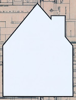
Since we filmed in a house, we have decided a strong idea for the poster would be to place our on set images into rooms of a house like a dolls house. We thought of this idea because in A2 English Charlie is studying The Dolls house, a Norwegian script by Henrik Ibsen. We would need to ensure that the house isn't too over powering, and we find colours which compliment our idea. We have decided it would be easiest to use a dolls house template which is a decent size and gives us a lot of options for how we lay out our images.
Tuesday, 17 November 2009
Screen grab possibility
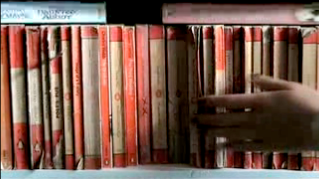
I think this is a good shot because it's mysterious and i think that it give you the impression of the mise en scene of the music video. I think that it gives a good background image for some writing about the band. I also think this is a strong image for the band. I think the hand also gives the shot a certain mystery about it.
Labels:
Greg
Screen Grab Possibilty
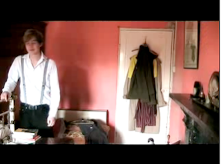 I think this is a strong image as the rules of thirds work well, placing the male character to the left and leaving the rest of the space for the necessary information needed within digi-paks. It is not too busy, so the eye would be drawn to the writing first, followed by the background image. As it's a screen grab, it has a strong link to the music video we have produced.
I think our mise en scene was strong throughout, and is a aspect we should follow through to our magazine adverts and digi-paks. The rooms we filmed in had a strong authentic feel to them, so this works well as not only does it show artist recognition, but a room we filmed in.
Initially i would place the font to the right, and avoid the dark fire place located in the bottom right corner. This would be a perfect image for either the front or back cover, i think a strong photo to follow over would be one of the girl in a room as it would mean both artists are featured.
Labels:
charlie
Screen Grab Possibility
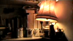
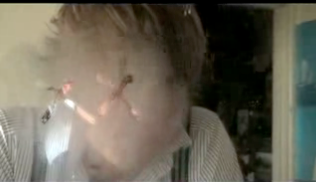
These are the images i think would possibly look good for the digi pak.They fit the genre with nothing to lively in your face and mellow colours.I think they could appeal to a number of audiences as they one on the left could appeal more to fans who admire the artist, which promotes the artist more.The one on the left appeals to the maybe more mature music fans simple and elegant.The one on the right also incorporates the band name in the picture which will catch attention.
Labels:
Alice
Monday, 16 November 2009
Digi-pak immediate ideas
First intial idea of Digi-Pak
 I think cartooning is a very strong way of editing an image. It was influenced by Mika's 'We Are Golden' Album and poster look which has a cartoon feel to it. The font used for the titles may have to be a bolder colour such as a red to match the one in the flag within the image, red is a good colour to use as it grabs the viewers attention. I would need to find a strong image which works well with this one, possibly a close up of a few items with a subliminal message of 'xx' in it. I decided only to outline the foreground of the photo, i thought that creating the same effect over the whole image would be over powering. The colour in the image match our music video, however i did slightly change the saturation to make it a bit more dull.
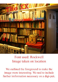 I cartooned the foreground of this, unfortunately there isn't much in the foreground of this image compared to the one of the attic. I decided to use a bold red font, having found from the previous rough that the grey wasn't very effective. I used the lines of the shelves to incorporate the writing into the image.
Contact sheet of images taken during our filming
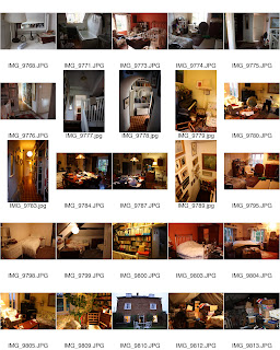 The photos are very strong and work well, the lighting created very warm effects and cast shadows across the images following our strong mise en scene.
Anlysis music advert
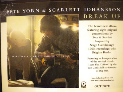
Shows the artists on the front
Shows the genre straightwaya with the acoustic guitar
the use of colours creams and browns - clam tone to it
Labels:
Alice
Analysis of Madonna Dvd
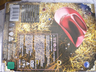
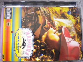
-Dvd of a single 'music' comes with 2 versions
-Features a logo made for the cover with the title and warner brothers.Also incorporated in the small logo they have put 7stars how ever this is just a design feature as they havn't put the actual rated figure.
-Tracklist on the back with the times of each song.
-a parental advisory feature on the front
-Inside there is a leaflet advertising dvd's for Madonna's and various other artists music videos, other then that there isn't much other bonus material with this dvd
Labels:
Alice
Digi Pak
artist name, Album name, image/motive of artist (band identity)
track list, Website
Institutional Info- label info ( who's in the band)
where was it recorded
special edition-
adds value (sell at higher price)
Extra Features-
interviews, live footage, poster, autograph, personal note, bonus tracks, promovideos ('making of feature'), interviews, discount vouchers
track list, Website
Institutional Info- label info ( who's in the band)
where was it recorded
special edition-
adds value (sell at higher price)
Extra Features-
interviews, live footage, poster, autograph, personal note, bonus tracks, promovideos ('making of feature'), interviews, discount vouchers
Labels:
Alice
Magazine Ad
GRAB ATTENTION-Reviews (music press, newspapers, celebrities/ dj)
Image
ADVERTISE-
Name of album
Bands name
date if release
where it's available
WEBSITE
Band official, myspace, twitter, facebook
How successful is it as an ad?
What relationship does it have with other products ?
How is the artist represented?
Who is the audience?
Image
ADVERTISE-
Name of album
Bands name
date if release
where it's available
WEBSITE
Band official, myspace, twitter, facebook
How successful is it as an ad?
What relationship does it have with other products ?
How is the artist represented?
Who is the audience?
Labels:
Alice
Monday, 9 November 2009
Refilming Plan
We are going to re film on Monday 9th.this leaves room to edit before our final deadline on friday morning.
We plan to do the performance footage again work on featuring the artists more with close ups and direct gaze.We also decided to put the artists in different costumes and a new location.
Here's a music video that uses some conventions that we would like to achieve in our re filming of our artist performing. We like the slow close ups and focusing in of the artists and we have found a similar location to the one in this video.
The Choirboys
ethan | MySpace Video
Location of re filming
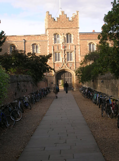
Jesus University Cambridge
Charlies little brother sings in the choir and her mother has already asked and it's fine.the location goes really well with our style and look for the video.
Labels:
Alice Greg Charlie
Tuesday, 3 November 2009
Editing and review over roughcut
We have completed our rough cut and received some positive feedback. The main thing people pointed out was the lack of lip syncing and the artists aren't featured enough.So we are planning to do another filming session and incorporate some more lip syncing maybe on a new location.
So far we have doen quite well we have the shots we want to use in order and nearly timed right.Now we have to do some more editing and start transitions if necessary and filters so the scenes run smoothly together and aren't to contrasting with colours.
Using the colour corrector in final cut we have changed the tone of a few shots here is one of the ones we have changed.
Labels:
Alice
So far
I think that our rough cut has been very affective, it fits our pitch very well and i am proud of what we have managed to achieve. I think for our final we need to filter the images further so that they run smoothly from shot to shot. Some transitions may also need to be tweaked and we have thought about doing some further filming on a different location of some performance work as we lack lip syncing.
I have recently looked into the XX as they were featured on channel 4 recently playing a live acoustic version of Heart Skipped A Beat. They released their single called 'Basic Space' on the 3rd August which was available on 7" and 12", it is available to buy at Rough Trade. They have now released their album called 'xx' which is available to UK fans which you can buy online. They plan on touring Europe during the winter, ending up in Britain towards the end of March showing how they are beginning to build up a reputation for themselves. The band are made up of four 19 year olds from South West London who signed up to xl sub-label where they also recorded their songs.
Labels:
charlie
Teacher Feedback on Rough Cut
I think you have some very good examples of framing and the material selected is absolutely appropriate to the task. Your mise-en-scene selection is also very strong.
In terms of improving your video further I think there are a few things you could do. The purpose of a music video is to sell an artist as well as a song and so it is important that the viewer can see the artist, in detail, as soon as possible. Therefore I think that more close-ups of your two performers earlier in the video could work well. In addition I know that your intention was to create a complete narrative but I think that more performance would only enhance it further. is it feasible for you to film your characters both singing the whole song, in the same costume, ideally in the same or a similarly suitable location?
I also would encourage you to consider adding a filter to more effectively communicate the idea of constantly searching for a lost love. Take a look at this video from last year which is very strong at using filters to great effect in communicating a dream-like world.
Use this video as a basis for thinking about how you could improve your video further.
What you have achieved so far is excellent, keep up the good work.
Labels:
Acj
4. Peer Feedback
Notion of looking
There was a large range of shots in the music video making it very interesting to watched, they were all framed really well and were all relevant to the theme they were obviously following.
The acting in it was good and the actors were believable for the part, the only criticism we have is that there was a lack of lip syncing.
Artist representation:
They managed to get the notions of looking and direct gaze right as they didn't use too much of it, you mainly saw the actors backs which worked as it made you feel as if you were watching them. They were represented as being quite innocent and pure for example the girl wasn't covered in make up and the clothes were simple yet formal.
3. Peer Feedback
Lyrics and Visuals
For a song with limited vocals you have managed to link the lyrics and visuals well especially with the "i'm not finished" written on the music score and where the handle is being turned when it says "struggling to get in". The lip syncing is good but it may look better with a bit at the beginning to introduce the male and female characters. Cutting to the beat is good but slightly off at the start but good throughout.
Lots of different shots, quick changes, good story telling, good costumes and interesting footage.
Labels:
Bianca Bain,
Conor Murphy,
Ed Neely,
Joshua Grief
2. Peer Feedback
Music and Visuals
The song has quite a slow beat and the cutting fits this well. The visual of the piano does not fit with the instrument playing but the shot is well used and fits in with the time period its set in. We liked the use of the props, the old clock and the globe, as it fitted in with the tone of the music.
The song has quite a slow beat and the cutting fits this well. The visual of the piano does not fit with the instrument playing but the shot is well used and fits in with the time period its set in. We liked the use of the props, the old clock and the globe, as it fitted in with the tone of the music.
1. Peer Feedback
Genre Characteristics
We feel that the video matched the genre of dream pop. As it featured a lot of the artists in a believable storyline. Which was also a love story which features in a lot of pop.
I felt that the actors played their parts really well with good costumes and props but maybe there could be a bit more performance with both actors in the same shot.
The video featured several interesting camera angles such as looking in a mirror reflection or out from under a bed. This gave a more interesting videos as not all of the shots were the same. The mise-en-scene (an old-style house) is excellent as it provides some very interesting shots and works well with the song which in turn connects the video to the lyrics.
Level 3
Monday, 2 November 2009
Final Rough Cut
This is our rough cut, we plan to do more editing, for instance add some filters and smooth out some of the cuts.So far we are pleased with all the shots we have collected and it all seems to be working well together.The only thing that seems to be a bit weak is the performance and needs to be worked on.
Labels:
alice charlie
Monday, 19 October 2009
Greg's auteur presentation
S1 Auteur Presentation - Jonathan Glazer
View more presentations from Media Studies.
Charlie's auteur presentation
S1 Auteur Presentation - Jonathan Glazer
View more presentations from Media Studies.
S1 Music Video Analysis - Goodwin
View more presentations from Media Studies.
alice's auteur presentation
S1 Autuer Presentation - Spike Jonze
View more presentations from Media Studies.
Editing
We need to make sure our footage follows a clear narrative as well as incorporating lip syncing.Our editing so far has been for the rough cut, so we have just been cutting clips to the beat and we will go over later to make it smooth together.We want to create a flow with our images and the music, this will make the music video more effective to the viewer.
This is the Kooks video for Naive.This music video follows the editing we want to achieve for our music video, its slow cutting but really works well.
The Kooks Naive
Ulli-Bulli | MySpace Video
This is the Kooks video for Naive.This music video follows the editing we want to achieve for our music video, its slow cutting but really works well.
The Kooks Naive
Ulli-Bulli | MySpace Video
Labels:
Alice Greg Charlie
Monday, 12 October 2009
Filming Completed
Our filming on Saturday went successfully, we arrived at midday in Scalford, Melton Mowbray and filmed until seven. We struggled a bit with lighting as we had to go from natural to artificial throughout the day. We completed our footage using one tape but found towards the end we had ran out of space and therefore had to film over some of our footage.
We constantly referred back to our storyboard and decided to film in order of it, once we had all of the narrative footage we filmed some lip syncing in the cellar which wasn't originally in our story board but worked very well. Once we had completed lip syncing we filmed some extra footage of objects in case we needed some extra footage. It's good that we chose to do this since shots such as the close up of the chimer in the grand father clock are very strong.
We constantly referred back to our storyboard and decided to film in order of it, once we had all of the narrative footage we filmed some lip syncing in the cellar which wasn't originally in our story board but worked very well. Once we had completed lip syncing we filmed some extra footage of objects in case we needed some extra footage. It's good that we chose to do this since shots such as the close up of the chimer in the grand father clock are very strong.
Labels:
Alice Greg Charlie
Teacher Feedback on Blog and Pitch
Your pitch was excellent and had a really strong consideration of the mise-en-scene you are hoping to create and you had clearly thought about how to incorporate a variety of shots, which is essential for maintaining the viewers attention. I really like the hide and seek theme to the narrative, it fits perfectly with the song. I do think it is important to incorporate more opportunities for lip synching. It was clear from your pitch that you have done a considerable amount of planning.
Your blog is looking good but there is still room for improvement if your blog is to accurately reflect the grade you currently deserve. You must all upload the Goodwin and Auteur presentations that we did in the first few weeks, include a description of the task before uploading the presentations and don't forget to tag them correctly.
You also need to include some context and analysis of the images you have researched as inspiration for the digipak and magazine ad - what is it you like about them, what are the conventions of these products, what is effective, what doesn't work so well etc?
In addition some visuals to illustrate the props list would further enhance your blog.
It is also really important that your blog illustrates development of your ideas for your digipak and your magazine advert too so you need to sketch out those ideas and blog them too.
Good work so far, keep going.
Labels:
Andrea
Location shots
We photographed our locations as the stills may be useful for our digi-paks or the magazine ads and also so that we could plan thoroughly and use the space well. These locations are all in Charlies Grandparents house which has two floors and various rooms full of interesting objects. Our animatic uses alot of these areas so it was very successful.
 This is the landing of the first floor, we used this area for the ghosting idea, and also for alot of the shots where the girl and boy pass one another ^
 This is a bedroom on the first floor, we used this room for a lot of the hide and seek ideas for back up footage and also when Greg opens the cupboard ^
 This room was used quite a lot throughout our filming, both in match-on-action where Greg looks under the bed and also when he sees the door trying to be opened ^
 The bathroom is where we used the mirror, it was good because it is quite a light room, also Charlie filmed herself lip syncing sat in the chair to the left ^
 This is the mirror used during the introduction of Charlies character, situated on the second floor of the house ^
 The attic was full of old boxes and unused objects which had a strong mise en scene, we used this footage at the end of our rough cut and kept some for the end of our final music video ^
 This is the main bedroom, it is used when the girl is looking under the bed and the bright light filters it ^
 The shot of Greg's lip syncing through the window is done on this book shelf, the window is situated on the top shelf but is covered up by books usually ^
 This is the bedroom where we're introduced to Charlies character ^
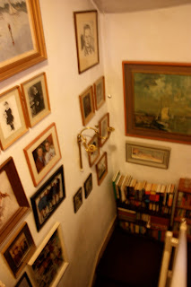 These are the photos and paintings which are located on the stairs going from the first floor to the ground floor, unfortunately we did not get any footage of them as it became too dark and the artificial light was reflecting too much ^
 The dining room was used a lot during the filming, we filmed lip syncing in here, and also the rocking horse, shots in the mirror and match on action with the draws ^
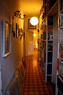 The corridor leads from the stairs to the sitting room, the door to the right leads to the study where we filmed the Grandfather clock, the door straight ahead is the Dining room ^
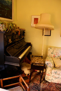 Here is the piano where we first see Greg's character sitting ^
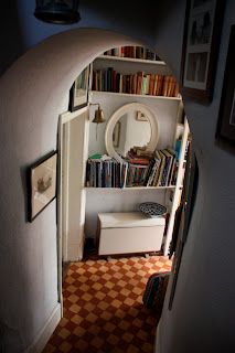 This is a shot looking down the stairs towards the corridor, to the immediate left is the stairs to the cellar and the pantry, the door to the left is the dining room ^
 This is the landing of the first floor, we used this area for the ghosting idea, and also for alot of the shots where the girl and boy pass one another ^
 This is a bedroom on the first floor, we used this room for a lot of the hide and seek ideas for back up footage and also when Greg opens the cupboard ^
 This room was used quite a lot throughout our filming, both in match-on-action where Greg looks under the bed and also when he sees the door trying to be opened ^
 The bathroom is where we used the mirror, it was good because it is quite a light room, also Charlie filmed herself lip syncing sat in the chair to the left ^
 This is the mirror used during the introduction of Charlies character, situated on the second floor of the house ^
 The attic was full of old boxes and unused objects which had a strong mise en scene, we used this footage at the end of our rough cut and kept some for the end of our final music video ^
 This is the main bedroom, it is used when the girl is looking under the bed and the bright light filters it ^
 The shot of Greg's lip syncing through the window is done on this book shelf, the window is situated on the top shelf but is covered up by books usually ^
 This is the bedroom where we're introduced to Charlies character ^
 These are the photos and paintings which are located on the stairs going from the first floor to the ground floor, unfortunately we did not get any footage of them as it became too dark and the artificial light was reflecting too much ^
 The dining room was used a lot during the filming, we filmed lip syncing in here, and also the rocking horse, shots in the mirror and match on action with the draws ^
 The corridor leads from the stairs to the sitting room, the door to the right leads to the study where we filmed the Grandfather clock, the door straight ahead is the Dining room ^
 Here is the piano where we first see Greg's character sitting ^
 This is a shot looking down the stairs towards the corridor, to the immediate left is the stairs to the cellar and the pantry, the door to the left is the dining room ^
Friday, 9 October 2009
Contacting The XX
 We decided to contact The XX to inform them that we're using a song of theirs to create a music video for our project. To do this we used their myspace and messaged them, if we do not get a reply we will email them using the email address on their page.
Labels:
Alice Greg Charlie
Animatic
This is our animatic; we spent a lot of time on doing every shot to make sure our filming goes smoothly, and to help us when we start to edit to get the timings right. We decided it would be helpful to write down the time in which we would like each shot to be shown, and it's duration, this will help us know how long we need to film for.
Labels:
Alice Greg Charlie
Monday, 5 October 2009
Inspiration for music advert/poster
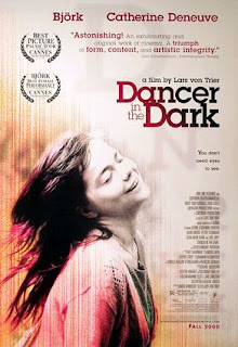
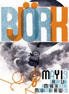 These are some music adverts/posters we like.We really like the colours they've used and how they have manipulated the photos and the effect it has.
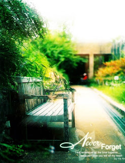
inspiration for Digi pak
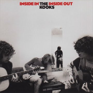
These are some Cd covers we found, the theme of these covers really goes with our music video theme.We want to create the same style for our Digi pak with the mellow colours and simple ol school style.
Friday, 2 October 2009
Props &Costumes
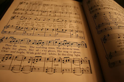
Costumes
-floral dress
-no makeup/plain looking/naturally pretty
-wooly tights
Boy:
-white shirt
-braces
-black trousers scruffy
Props
piano
mirror
sheet music
photos in frame of couple
books
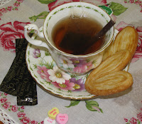
coffee mug
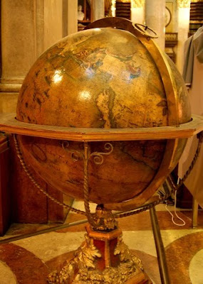
globe
cat
books
coffee mug
globe
cat
Actors
The people who will play the two artists will be very important to chose as they need to both 'suit' one another and fit the part. We have asked some friends if they'd be interested in being in our footage.
For the girl part:
For guy part:

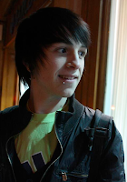
We decided that most appropriate would be Charlie and Greg as it would be more reliable and we both know how we would like our footage to turn out and would achieve it at a high standard.
For the girl part:
For guy part:
Greg

Sam
Jay

We decided that most appropriate would be Charlie and Greg as it would be more reliable and we both know how we would like our footage to turn out and would achieve it at a high standard.
Labels:
Alice Greg Charlie


